The preliminary task was to create a front cover for a school magazine. The cover had to contain specific conventional aspects of a magazine such as;
- A masthead
- A sell line
- Cover lines
- A mid-shot of a student
Magazine research
Before creating my own school magazine, I analysed existing covers to gather typical conventions for my own production to make it as successful as possible.

The masthead of this magazine is stereotypically at the top of the cover, and written in a clear font that makes it easy to read. The heading is also quite bold which makes sure the audiences first glance is at the heading. The colour of the masthead links to the colour of the students jumpers which gives the magazine a professional and sophisticated look. The sell line, above the masthead reads "Achieving success together" is quite personal and therefore appeals to parents as well as students. There is only one cover line on the front of this magazine but it is in keeping with the colour scheme as the colours of the bold and easy to read fonts, complement each other and are again, linked to the image. Although the magazine does contain some stereotypical features and positioning of other magazines, it doesn't contain many other conventions of a magazine such as a bar code. The main image is typical of a school magazine, featuring students in a school uniform but this may only appeal to the younger audiences because of the age if the students.

Similarly to the first magazine cover, the masthead is featured at the top of the page again, this ensures the audiences first glance will be directed at the header. Although the font is easy to read and stands out, it's name of "High Profile" doesn't indicate what the magazine is about or which school it is from etc. There is no sell line that could persuade audiences to purchase or take the magazine and the magazine cover ,again, only has one cover line however, it does offer a it more information and could therefore get the public interested in the cover story enough to purchase the magazine. The cover line is in bigger writing which makes it easier and quick to read in order to interest the public. The main cover story links to the picture and includes a play on words that would again appeal to the public and try to interest them in the cover story. As well as linking the picture to the words, the picture is also linked to the colour scheme similarly to the first magazine cover, the colour of the font is taken from the picture and makes it more aesthetically pleasing.

This cover takes the form of a more conventional magazine by incorporating stereotypical characteristics of other magazines for example the use of a bar code and a number of cover lines. Like the other two magazine covers, the masthead is featured in a bold and easy to read font at the top of the cover drawing attention to the words, in this case the initials of the school. This cover contains a number of cover lines making the magazine appear to have more content which would potentially interest the public further. The cover lines are in a range of sizes, with the more important cover lines in a larger font, this ensures the attention of the public is drawn to where the editor intended whilst making the cover more interesting and aesthetically pleasing. Although the main image is of an older person this could appeal to the target audience of students from the school as they may recognise her however it maybe more effective to use a student instead of a teacher. The colour schemes are revolved round the image again using colours that complement each other.
Magazine drafts

In the first stages of my school magazine production, I drew some possible layout ideas for my magazine. I designed the magazine covers with conventions I had discovered from analysing existing school magazine covers. Some of the ideas were more conventional than others but each helped me to explore different layouts and helped me decide on one idea to develop into the actual magazine cover.

Once I had decided on a layout for my magazine cover I then started developing ideas for my masthead, sell line and cover lines (left of image). I decided between two different mastheads either "MHS" or "Monkseaton". Decided on "Don't miss out" for the sell line and a number of ideas for the cover lines. I then applied these to a more developed draft of my magazine cover (right of image). I also decided to include a website address at the bottom of the cover.

After creating a number of sketched drafts, I created a draft on the computer to give me a better idea of what it would look like. After this I created a similar draft that included my chosen cover line, masthead and sell line.
Cover Image

Before taking my photographs for my magazine cover I created a plan exploring different locations, positions and ideas for the images. I created a mind map with seven of my favourite ideas but i eventually decided on one plain image of an a-level student standing against a white wall (below) I thought this would allow me to edit and manipulate the image easily and also keeps the attention on the student rather than the surroundings.

Original image taken. To be featured on the front cover of the school magazine. Mid shot of a-level student leaning against a white wall. Simple image keeps the attention to the student rather than the environment around and allows for easy manipulation of image.


Images edited on fireworks. By changing the brightness and using other tools, I created a range of effects. I like the first image with the blurry background which would work well with my cover story about exam stress. The cover line for this story will be over the models legs.

Front cover so far. I have tried to keep a basic colour scheme but some fonts are hard to read over the bottom of the image however I think the blue and grey compliment each other and are also in keeping with the image. I have included a website link at the bottom of the page to make it look more like a real magazine as well as a sell line to the left of the page/masthead. I've used a bold and easy to read font for the masthead which I felt was important because it is a convention of most magazines. Although I have only added one cover line at the moment I want to include some more at either side of the model. I decided to use the blurred image because it went well with the story about exam stress. I'm quite happy with my magazine cover so far but I still intend on adding more cover lines and working on the colour scheme to ensure it is easy to read.

Contents page


Once I had decided on what changes I needed to make, I started developing my draft. I added shadow behind my masthead. As well as giving the cover lines shadow and a black outline. I also added three more cover lines around the model to try and make it busier and more conventional.
Contents page

The above contents page has a very simple layout but is still effective and looks good. The page contains page has a very simple but sophisticated colour scheme making the page look very professional and also makes it easy to read. Each of the colours are linked in with the image. The text on the contents page is made up of two different fonts which are both easy to read. The numbers for the pages is in a different font, font size and colour to the rest of the text which makes them stand out whilst making them look more aesthetically pleasing.

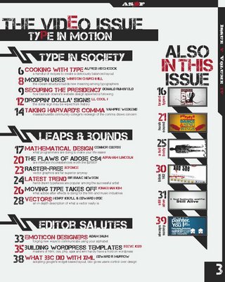
This font cover takes a different approach and contains a lot of text and many images. Although this still looks very professional, I think the cover looks a bit crowded and could potentially put the reader off. However the colour scheme is kept simple and the text is an easy to read font but may be a bit small. The page also includes a title on the side which is slightly unconventional as the title is usually featured at the top of the page. Although the use of an image as a background is not very common but I think it looks good and would appeal to audiences.
This contents page takes a more conventional look that above pages with very few images and the text broken down into easier to read sections. Although the text is broken down into sections the font is not very easy to read. The colour scheme is kept very basic making the page look professional and not too busy, all of the colours complement each other and further break the text down into easy to read chunks. The text is also a smaller size to the page numbers which is common in magazine contents pages.
Contents page drafts
To begin my contents page production I created a range of drafts for my contents page using the conventions I gathered from my analysed contents page. With the image at the top left of the page I used a notice board effect making the stories looking like they were pinned on a notice board and a stereotypical title line. I quite liked this idea as it linked into the school theme. The second image on the top right i used a conventional layout for the stories which although would look professional, wouldn't look very interesting and may put the reader off, I carried on this theme through to the bottom left with a few changes making it look a little less conventional and more interesting. I finally decided to develop the bottom right image because I thought it was different and unique.
After deciding to develop on of my ideas I created it in more detail (right) sketching it bigger and including the inside stories and articles. I then created a range of ideas for my inside stories and then decided on six finals to put on the contents page including "Comic relief plans... get your ideas in quickly!" and "The truth behind leaked report"


Basic computerised draft of my contents page including the inside stories and titles. Decided on an unconventional title position to make the page more interesting, I used the same font and colour as the cover page and also decided to use the school logo coming down from the page which could of been continued throughout the magazine creating house style.
No comments:
Post a Comment