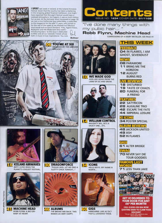
Although Kerrang has quite a crowded house style and the designer has crammed as much content as possible on to their front covers etc, this is not applied to their contents page. The contents page is much more organised and has quite a block layout. They have used a number of images to illustrate the main stories giving the contents page quite a 'catalogue' look but also makes the list of articles easy to read and could potentially keep the readers more interested in the content. Although this takes up the majority of the contents page there is still space for other features which makes the the page look more professional. For example an editors letter, giving the contents page a personal touch and keeps the reader in touch with the reader. There is also space on the right side of the page, for another contents list of the smaller stories etc which are broken down by subheadings in a different font and colour. There is a basic colour scheme running through the contents page which is made up of contrasting colours black and yellow which are known to stand out on each other. At the bottom right side of the page, there is a separate red box giving details of how to subscribe to the magazine, self advertising on the magazines contents page is a quite conventional. Underneath the title the editor has included a quote from famous artist Robb Flynn from Machine head, followed by a reference to an article and a page number, this is to interest the artist and encourage them to read the features story.

This Vibe contents page has aspects of a magazine front cover with a large masthead, basic colour scheme and mid-shot of an artist. The background behind the artist has been kept simple so text that has been placed over can be read. The background features a large 'V' which links it to the magazine name and also creates a kind of house style. The designer of the vibe cover has kept the design simple whilst incorporating stereotypical conventions of a music magazine contents page for example details how to subscribe at the bottom of the page and similar font choices. For example the change in colour and font between the page number and the content description. However, the font for the contents description is kept the same and although looks good, may be hard to read. The contents list is also quite conventional, a singe list on the right side of the page which has been separated by two different subheadings which are stereotypically more bold than the other text. On the left side of the image there is a short description, naming the artist and where the clothes he is wearing are from, although this is not very conventional for a music magazine, it could be useful to offer a short description of the image. The colour scheme has been taken from the photograph and although is quite dark, it looks professional and is brightened up slightly with the red heart on the photograph.

From looking at this page it is easy to see that NME have applied their house style with their logo and their red and black colour scheme. NME has a similar layout to the Kerrang contents page, with a large image reflecting the cover story and then a list of featured artists and a separate list for other content. Although the text is broken up and in separate sections which may make the contents page easier to read, the page is mostly made up of text instead of images which may make the reader lose interest in the content. Similarly to the Kerrang cover, the magazine advertises itself but offering subscription information. This music magazine also features quite stereotypical features of a contents page, which are easy to see in the text, for example the content description/articles are kept short so the reader can quickly read them whilst keeping interest. The page features two contents list, a list on the right with a number of articles and a list on the left naming all of the bands that are in the magazine. The contents lists have one convention in common that is typical of magazine contents pages, which is the difference in font colour between the content description and the page number, this is to ensure they are kept separate and to break up the text. As well as two contents lists this page features a type of cover line, in the center of the page, the editor has written a short description of a feature in the magazine which may interest readers. Since the description is written in a larger font than the other content descriptions and the image is in the center of the page, the readers attention is automatically drawn to it.

The spin magazine contents page features similar characteristics to the previously analysed pages. Spin magazine has a mid-shot image of the featured artist with a direct address giving it the look of a front cover, similarly to Vibe magazine contents page. Not only does this keep the focus on the featured artist, it also keeps the page simple and the attention kept on the text. This contents page also holds very stereotypical features of a music magazine contents page, for example the texts font, size and colour difference between the page number, brief description and full contents description. The contents list has left justification keeping it all to one side making it look simple, neat and professional looking. Spin magazines contents page also includes the logo which has been continued from the front cover, creating a house style. This cover also features a small box at the bottom of the page giving details of how to get the cover picture as a poster and how to subscribe to the magazine, this self advertising is a stereotypical feature on contents pages. At the right of the image the designer has included a quote from an interview with the featured artist, followed by the name of the artist and a page number which could interest the reader and direct them to the interview. There is quite a basic colour scheme running through this page, using the black and blue from the photograph in the text and subscription box however the spin logo and pink guitar from the photograph do not co inside with the colour scheme.
Contents page research summary
Typical conventions of music magazine covers include...
- Self advertising, a separate box including details of how to subscribe to the magazine
- A quote or quotes from an artist, linking to an article in the magazine
- Two separate lists of contents usually including a list of features artists and a list of articles inside the magazine
- Photograph or photographs of featured artists
- Aesthetic features that are usually continued from the front cover, creating a house style, for example a logo or colour scheme.
- A different colour, font or font size for the article description and page number
No comments:
Post a Comment