Whilst creating sketches for my contents page layouts I decided that I was going to create my contents page as a double page spread rather than a single page because this allowed me to fit in all of the features I wanted such as a band index, a contents list, a special features section, subscription details, editors letter and a title.
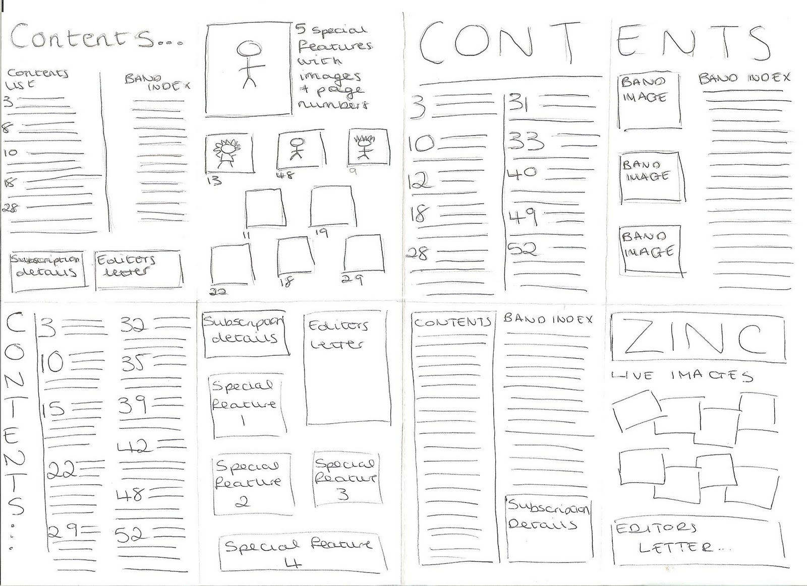
Similarly to my cover pages, my contents ideas were quite conventional and each involved using the same features in different ways to create the style I wanted. On each of my contents page, I continued a number of features throughout such as a title, a list of inside features, a few images and subscription details. These are all conventional features of a contents page. I decided that I would carry the colour scheme through from my front cover which created a type of house style which could be carried through to my double-page spreads. On each of my sketches I decided to make the page number larger than the article description to separate the features whilst making them easy to read. I also included subscription details on each of my sketches which acts as a kind of self advertisement getting people to sign up to get the magazine weekly. In all four of my sketches i separated the pages into different sections, which included one contents list which listed a number of things that are featured weekly in the magazine and another list that lists a number of special features which are accompanied by images. After analysing my sketches with my target audience in mind I decided that the sketch in the top left would be best suited for the features I wanted to include as well as what typical features my target audience wanted to include such as a band index. I particularly like this layout because I think its a good use of space, making it easy to follow whilst still being interesting with my use of images and separate sections for different features.

After creating my initial ideas. I created a more developed sketch of my contents page but this time included less special features reducing the numbers from 9 to 5 so that the images could bee larger and therefore seen more easily. I also added a heading above the special features saying "This week" to highlight the fact these features were different and therefore interest the audience. Below my developed front cover sketch, I created a mind-map of ideas that I could put into my contents lists. I revolved these round my target audience so that when they are scanning down the list of magazine features they are interested by the listed articles. I decided that I would probably include all of my thought of contents ideas so that there is a range of content in the magazine for the reader but i particularly liked the articles "Flamboyant Bella, their big break up?!" because it acts as a rhetorical question to the reader whilst making them curious about the article topic. I also liked the article name "Darwin Deez, the Michael Jackson of indie rock" I thought this was particularly effective because it gives people two big figures to recognise and even if they don't recognise "Darwin Deez" as an artist, they would recognise Michael Jackson and would be interested to know who he is being compared to in the indie rock industry.
No comments:
Post a Comment