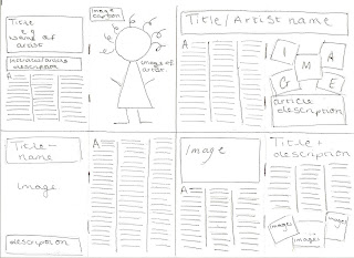
Before creating my double-page spread I planned and develped layout ideas that would make my article look both professional and aesthetically pleasing. Before sketching my designs I decided I wanted my double page spread to be an interview with an artist.
I firstly created four different double-page spread layouts. In each of my sketches I included an image of the artist, a title naming the artist and the article, an image caption and the interview in collumns. I also started each of the articles using a drop cap. Similarly to my other magazine page planning stages, I liked each sketch for different reasons. I think the top left image is quite conventional and is typical for a music magazine interview but I think it is still effective and allows the reader to see a large image of the artist as well as a title and an article description, because of this, I thought this particular design was quite organised and neat which made the article easy to follow and professional looking. The layout on the top right features less of a conventional layout with a numer of images looking like polariod images. Although this is quite unusual, I think the unique and different take on the images would appeal to my target audience. Instead of putting all of the text on one page like the previous sketch, I dotted it across the two pages which although is different, is quite messy and stops the reader reading the article in the order it was intended. Similarly to the first sketch, the bottom left sketch is quite conventional and still allows a large image of the artist to be seen. The last sketch at the bottom right, is again slightly unconventional and features a lot more writing than images which could potentially put the reader off the article. Another feature that would not be effective from this layout is the titcle and the article description at the top of the second page, this could be confused for the actual article and could spoil the interview.
I finally decided that I prefered the first image in the top left of the page which allowed me to fit in each of my chosen features and still look aesthetically pleasing. I also decided that I would put certain quotes of the article in a larger and italic font throughout the article which could be read easily whilst the reader was looking through the magazine and could potentially interest the reader and persuade them to read the article. Although i wanted to keep the text and the images seperate on my double-page spread, I will include an image caption, describing the image etc.


Emily - as you know the section of your blog that you've completed so far is for Research and Planning, which is given a mark out of 20. Your research is excellent and shows really detailed analysis. However, you need to be able for similar detail in your planning and must show evidence of your sketches (I scanned these for you), developed ideas and your photo shoot. Keep adding to it in your own time so that you have access to the higher levels; your research looks like level 4, but without all the other parts of this section you will get a much lower mark.
ReplyDelete